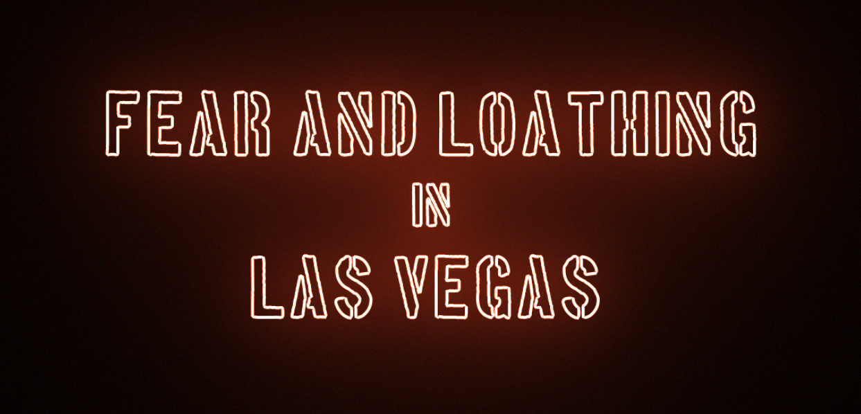
Background - fear and loathing in las vegas
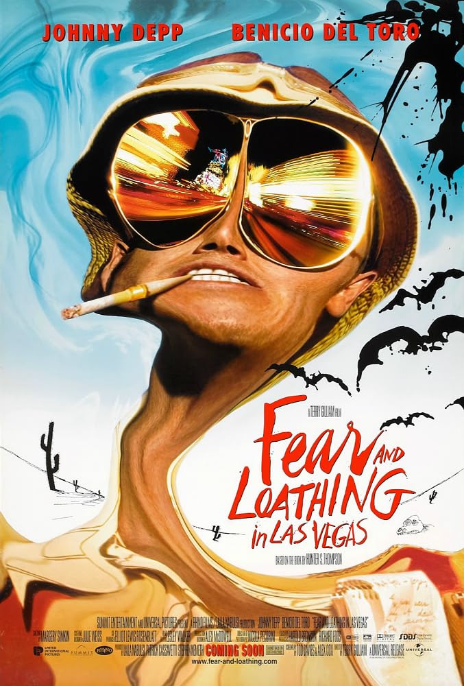
Fear and Loathing in Las Vegas is a cult classic film directed by Terry Gilliam, based on Hunter S. Thompson's semi-autobiographical novel. It follows the unhinged journey of journalist Raoul Duke (played by Johnny Depp) and his lawyer, Dr. Gonzo (Benicio del Toro), as they embark on a drug-fueled trip to Las Vegas in the early 1970s.
The film is a chaotic exploration of excess, freedom, and the disillusionment of the American Dream, portrayed through surreal and often hallucinatory visuals. It’s known for its absurd humor, frantic energy, and vivid depiction of altered states of reality, making it a wild and unforgettable cinematic experience.


design elements
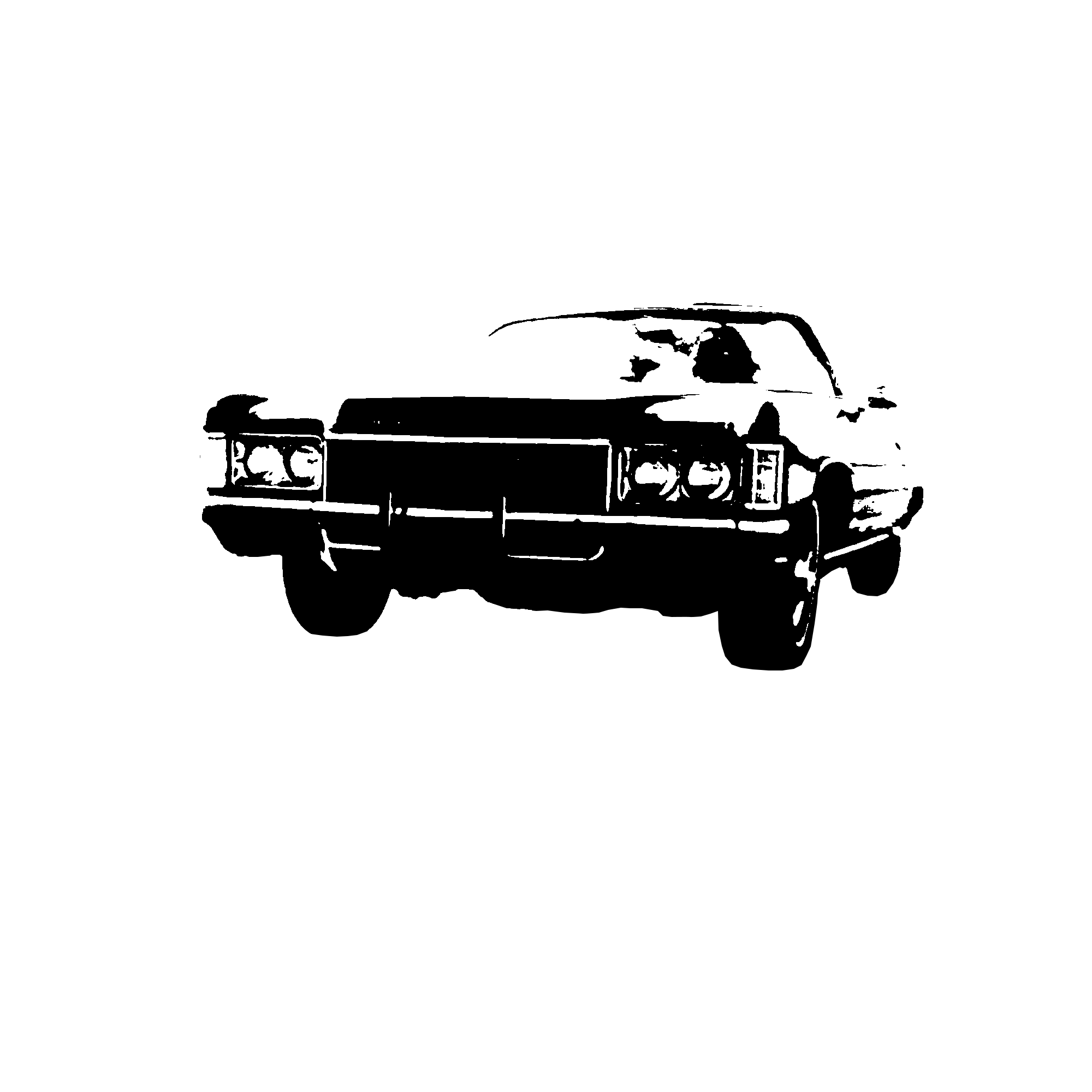
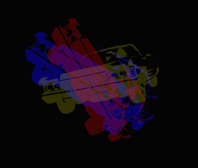
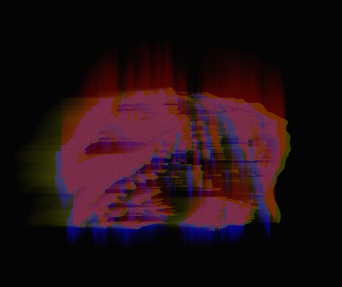
The design was crafted using images from Fear and Loathing in Las Vegas, which were converted into vector shapes to capture the film's surreal and vibrant energy. These shapes were then duplicated into three distinct layers—red, yellow, and blue—each set at a lower opacity. By overlaying these translucent layers, the elements gained a built-in visual effect that adds depth and complexity.
This approach ensures that when additional effects are applied in After Effects, the pre-stacked layers interact to enhance the overall sense of chaos and disorientation, mirroring the film’s psychedelic atmosphere.

Animation
The design was crafted using images from Fear and Loathing in Las Vegas, which were converted into vector shapes to capture the film's surreal and vibrant energy. These shapes were then duplicated into three distinct layers—red, yellow, and blue—each set at a lower opacity. By overlaying these translucent layers, the elements gained a built-in visual effect that adds depth and complexity. This approach ensures that when additional effects are applied in After Effects, the pre-stacked layers interact to enhance the overall sense of chaos and disorientation, mirroring the film’s psychedelic atmosphere.

fonts
The fonts Oswald and Boston were chosen to reinforce the visual storytelling of Fear and Loathing in Las Vegas. Oswald, with its bold and condensed style, captures the intensity and urgency of the narrative, reminiscent of headlines or impactful text from the era. Boston complements this with its typewriter-like aesthetic, evoking the film's roots in journalism and Hunter S. Thompson's distinctive writing style. Together, these fonts create a cohesive look that ties back to the movie’s themes and setting, enhancing the immersive experience for the viewer.
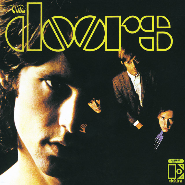
Song - Crsystal SHip by the doors
The choice of “Crystal Ship” by The Doors as the accompanying song for the title sequence is intentional, as it perfectly complements the film’s psychedelic and reflective atmosphere. The song’s haunting melody and dreamlike quality evoke a sense of escapism and the surreal, mirroring the characters' hallucinatory journey through Las Vegas. Its nostalgic yet eerie tone adds to the sequence's emotional depth, drawing viewers further into the film's world of altered realities and the pursuit of the American Dream gone awry.


